September 4, 2026
Ben Affleck
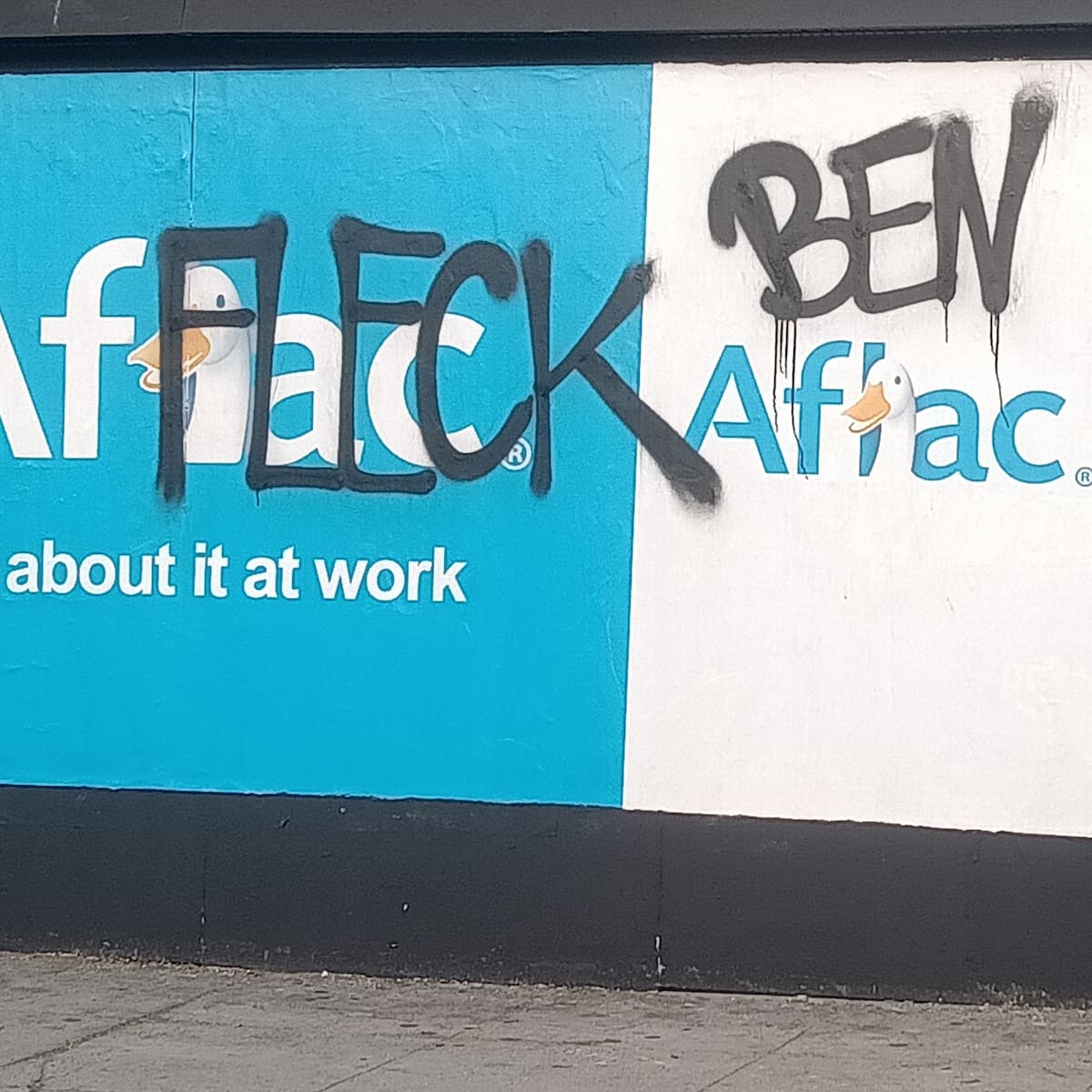
That man Ben be hitting the blackboards this week.
That man Ben be hitting the blackboards this week.
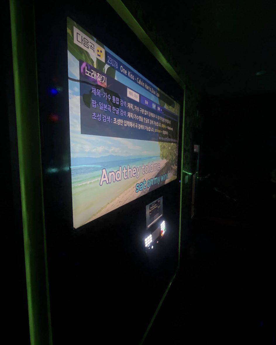
Screengrab from a noraebang, a Korean karaoke bar (it translates to "song room"), where we were celebrating Frankie's birthday. I didn't document the night at all, so I never got a photo of the screen myself. I borrowed this one off a random online review of the place.
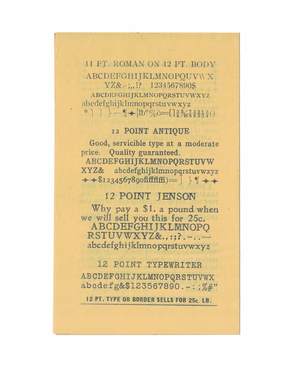
A specimen sheet from the Chemung Printing Company. "12 pt. type or border sells for 25c. lb." Type sold by the pound, back when a printer bought their letters as physical metal.
This is the source material behind Chemung Job. I scanned the sheet, cut out a bitmap of each character, and ran them through Potrace, which traces a bitmap into vector outlines. Potrace is built to smooth a scan into clean curves. I didn't push it that way, so the letters came out rough, edges and all. Maybe that's a misuse of the tool. It's my own rough take on the specimen, not a faithful copy. The face only has the characters this partial sheet printed, exactly as the specimen says.
Download it here. Source on GitHub.
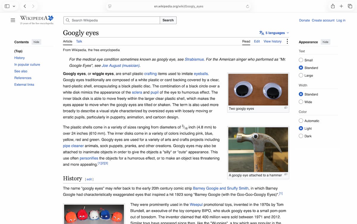
I had to look up what googly eyes were actually called on Wikipedia before I could make them a font. Type and they look around.
Grab it here. Source on GitHub.
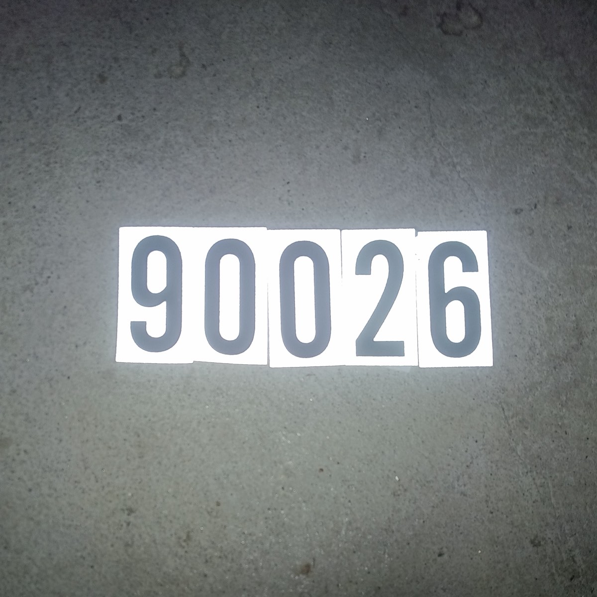
Every preview of this font on the site is a real LA ZIP code. Echo Park, Chinatown, Koreatown, etc.
That's where these numbers already live. On mailboxes, curbs, apartment doors. The vinyl digits you buy off a rack at the hardware store. I digitized them in a font, 0 through 9.
Free under the SIL Open Font License.
Download it here. Source on GitHub.
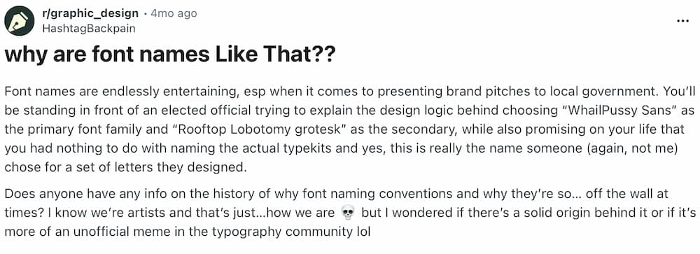
Credit to u/HashtagBackpain
Someone asked why font names are like that. To make the point, they made one up, WhailPussy Sans.
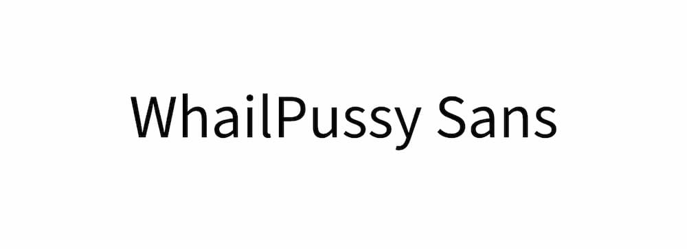
It wasn't a real font. Now it is.
There's more than one reason font names get like that. Here's one.
The Open Font License lets anyone take a font and put out their own version. No permission, no asking. The one thing you can't do is keep the name. Adobe reserved the name "Source". So it needed a new one, and there was already a name waiting on Reddit.
I took Adobe's Source Sans 3 and put the new name on it. I didn't touch the letters. Paul D. Hunt drew them and they're exactly as he left them. The name is the only part of this that's mine, and it isn't even mine really.
Based on Source Sans 3 by Paul D. Hunt, released by Adobe. Free under the SIL Open Font License.
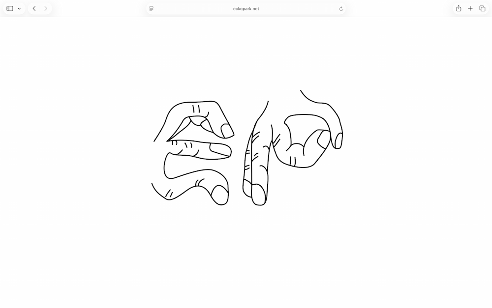
"E" and "P" in hand letters.
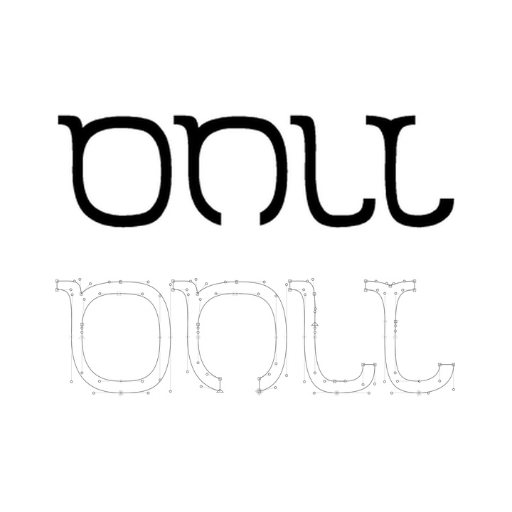
This started as a font that could only spell "ONLY".
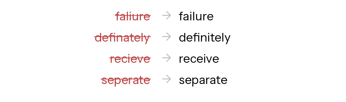
I was recording an intro video about myself to send to people, typing up a document while screen recording, and I typed "faliure" instead of "failure". Couldn't get it right. I just sat there staring at it. That's when I thought, what if the font just fixed it for me?
So I made Autocorrect. It's a font that corrects common misspellings. You type the wrong thing, the font shows the right thing. No spellcheck needed. Works in most apps. Based on Instrument Sans by Rodrigo Fuenzalida. Free under the SIL Open Font License.
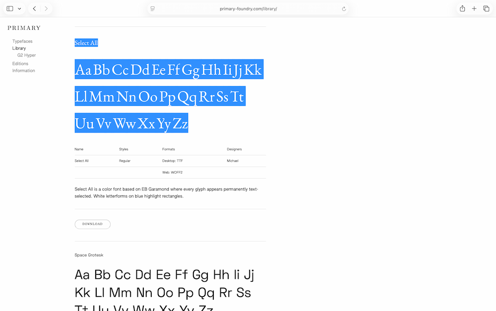
Select All is now on Primary Foundry's library. You can download it there alongside fonts from other foundries and designers.
Primary Foundry is run by Jonathan Maghen out of Los Angeles. The library is a curated collection of open-source typefaces available under the Open Font License.
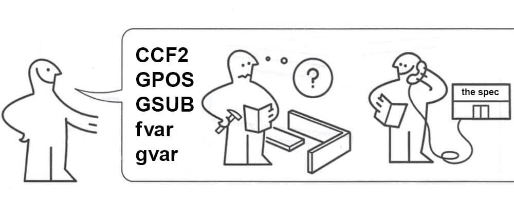
A font isn't just letters someone drew. It's a file with dozens of hidden parts that all have to work together or your text won't show right. The left shows the parts list. The middle is you trying to put it all together. The right is you reading the spec. Every font engineer has been all three of these people. I still get confused on what all the parts do. Learning as I go.